


Why This Website Gets Zero Leads Despite Looking Great
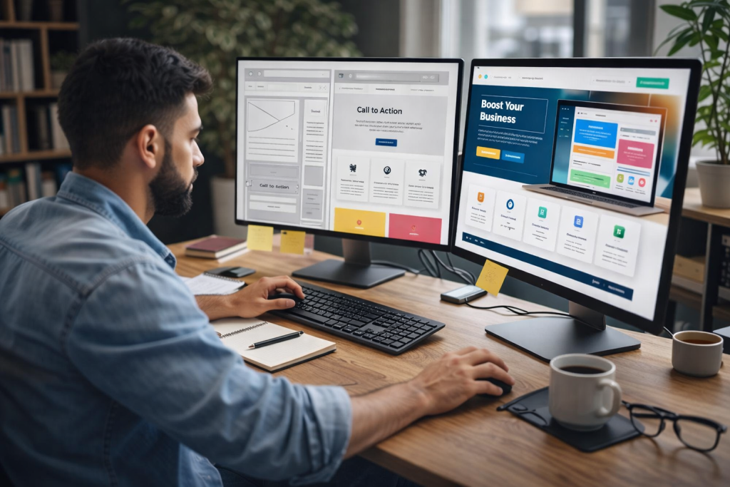
You spent weeks tweaking the layout. The color palette is flawless, the animations are smooth, and the typography looks like it belongs in a design museum. By all visual standards, your new website is a masterpiece.
There is just one glaring problem: The contact form is a ghost town. No inquiries. No quote requests. Zero leads.
It is a frustrating reality that many business owners face. A beautiful website gets people to look, but lookers do not automatically become buyers. If your stunning website is stuck acting like a digital paperweight, it usually comes down to three massive design and strategy disconnects.
At Grexotix, we audit underperforming platforms every week, and the truth is always the same: aesthetics alone cannot force a conversion.
- The “Brochure” Trap: You are Flirting, Not Directing
Most gorgeous websites make the mistake of acting like a luxury brochure. They present information beautifully but fail to tell the visitor exactly what to do next.
When a user lands on your page, they should not have to hunt for the next step. If your only call-to-action (CTA) is a tiny “Contact” link buried in the top right corner, you are losing money. The target buyer needs clear navigation signs.
- The Fix: Every single page needs a prominent, action-oriented directive. Instead of passive phrases like “Learn More,” use high-intent prompts like “Get Your Free Design Mockup” or “Book a 15-Minute Strategy Call.” Place these buttons where eyes naturally scan—in the hero section, halfway down the page, and right at the footer. As The Best Website Designing Agency In Ooty, our core focus at Grexotix is building layouts where user intent aligns perfectly with clear action steps.
- Desktop Vanity vs. Mobile Reality
It is easy to fall in love with a website while viewing it on a massive 27-inch designer monitor. But your actual customers are likely discovering your brand while standing in line for coffee, scrolling on a smartphone screen.
If those stunning interactive elements, heavy video backgrounds, or intricate multi-column layouts load slowly or turn into a chaotic jumble on mobile devices, users will bounce within three seconds. Search engines, voice assistants, and AI-driven answer engines also penalize sluggish mobile performance heavily.
- The Fix: Shift to a mobile-first mindset. Test your website on multiple actual phones, not just desktop simulators. Simplify navigation, ensure buttons are easily tappable with a thumb, and optimize images so the page loads instantly. The Top Web Designing Companies in Ooty know that a fast, streamlined mobile experience will always out-convert a slow desktop masterpiece.
- The Copy Speaks to the Ego, Not the Pain
This is the hardest pill to swallow: Customers do not care how great your business is. They only care about how you solve their specific problem.
Beautiful websites often suffer from “we-focused” copywriting. If your homepage is filled with text like “We are an award-winning agency utilizing cutting-edge frameworks to deliver premium digital synergy,” the user’s brain instantly tunes out. It sounds robotic, vague, and self-indulgent.
- The Fix: Flip the script to focus entirely on the customer. Replace abstract jargon with direct answers to their immediate worries.
- Instead of: “We provide robust, high-performance web architecture.”
- Say: “We build websites that load in under two seconds so you stop losing impatient customers to your competitors.”
The Core Blueprint for High-Converting Websites
To turn things around, stop looking at your website as an art project and start viewing it as an automated sales representative. A high-converting site relies on three pillars that The Leading Web Designing Company in Ooty builds into every framework:
| Pillar | Focus | What It Solves |
| Clarity Over Creativity | The visitor must understand what you sell within five seconds of landing. | Eliminates high bounce rates caused by confusion. |
| Frictionless Action | Minimize the steps required to get in touch. Keep forms short. | Prevents users from abandoning the checkout or contact flow. |
| Proof of Competence | Display concrete evidence—like real numbers, client video snippets, or case studies. | Destroys the skepticism that keeps people from hitting “submit.” |
The Golden Rule: Visual design opens the door, but clear messaging and effortless user experience close the deal.
If your stunning website is failing to bring in business, look past the aesthetics. Audit your layout for speed, rewrite your headlines to address real human pain points, and make your call-to-action buttons impossible to miss. If you want to transform your beautiful site into a lead-generation engine, let the engineering team at Grexotix fix the hidden cracks holding your business back.

